For quite some time I’ve been intending to write about pixel art technique. Today I stumbled on a pixel-art platformer game called Frogatto & Friends which has inspired me to get on this because I was struck by the game’s lovely art. (I haven’t actually played the game yet, though it is available for free on PC/Mac/Linux, and the code, but not the assets, is open source.)
So let’s see if I can explain what’s going on with the pixels of Guido Bos and Richard Kettering (who it seems also lead the art for Battle For Wesnoth; neat).
Use of Color
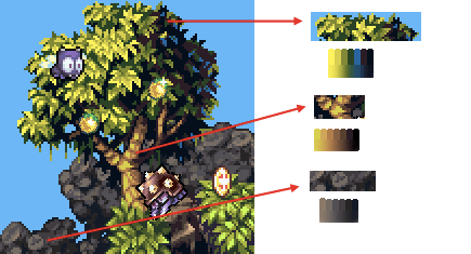
The artwork of Frogatto nicely demonstrates the intentional use of color (hue, in particular) to emphasize the depth of a scene. Warm colors pop out to the foreground while cooler colors recede to the background. I’ve pulled some of the color palettes out of a screenshot to show how this is operating:

Notice how much warmer the lighter colors are – the green and brown are pretty much the same shade of yellow at their lightest, while the stone’s gray takes on a noticeable brown tone at its highlights. On the other end, the green cools down even to the point of using a shade of blue while the stone goes toward a more neutral (and relatively cooler) gray.
The use of a blue tone in the tree is particularly interesting. It’s actually lighter than the mid-dark green but is so much cooler that it fits with the shadowy parts of the leaves – and the blue reflects the ambient, bluer light of the sky rather than the direct yellow sunlight — the use of color in the tree tells us a lot, very subtly, about the lighting in the environment.
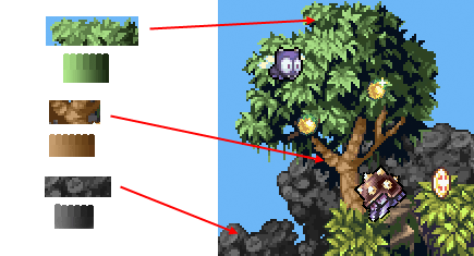
As an experiment I replaced the original colors with “naive” color palettes that are simply light to dark gradients of a single hue with no change in ‘temperature’ or saturation.

The scene still works (ignore the yellowish leaves in the lower right), which is a testament to the skillful use of tone and shapes, but it’s flatter and less full of life than before.
- In general, warm hues bring things forward, cool hues set things back. (Sometimes I like to play with inverting this rule to make a scene look weird.)
- Ambiantly lit shadowy areas can be ‘lit’ with a color that offsets the primary lighting; Consider what color is coming from the rest of the environment, or what color the sky is.
- Color can be used very subjectively. It doesn’t matter what exact color your color-picker displays, and it definitely doesn’t have to match the “naive” understanding of what color something is. What matters is how the color you use works in-context with the rest of the colors of the scene; Indeed, leaves can be blue.
[Yes, I’ve spoken out about how I don’t care for using small fixed palettes in pixel art. The upside of the practice is that it forces artists to be very conscious about their color choices, so from that perspective it promotes some artistic rigor and, on occasion, very creative use of color.]
And that’s that for now. This game has wonderfully rendered shapes – those pointy leaves and contrast between bulbous and cubic rocks – so it feels like there’s going to have to be another post on the art of Frogatto. Soon.
And how does this relate to Dredmor?
Well, Dredmor is filled with pixel art. This art does indeed have colors in it, and I apply the above concepts to greater or lesser degrees, depending on the particular application.
There is not as much depth and exuberance as Frogatto, I must admit. The reasons for this are indeed My Problem and have something to do with the setting of Dungeons of Dredmor (a series of underground rooms), the format of Dredmor’s maps (randomly generated therefore somewhat generic by-necessity), a lack of my early involvement in the visual design of the game’s engine (due to the groundwork being coded an unmentionable number of years ago), and finally our reluctance to redo major parts of the system due to working on what we expected to be a brief two month project … which has had its development time explode into two years or so. Um, not to imply that Dredmor does not indeed have deep and exuberant art in it – surely it does! Perhaps I’m simply being a perfectionist about all the little things I look back and feel like I could have done just a little bit better on; But one must ship someday, right?
Yes, it’s all a rich pixelated tapestry that’ll make for one hell of a post-mortem.

Handy blog, likely something I’ll refer back to somewhat on my own art doings to keep perspective.
haha ‘ART’ something vital for gaming development that I do not have as a skill myself. Though would be easier with 2D, maybe if I was to have a group i should persue 2D and not 3D unless I was using a easy drag and drop.
Pingback: Pixel Art Tools | Dots of Odd
Pingback: A response to Gaslamp Game’s “The Colors of Frogatto” « Frogatto & Friends