So we’re coming up on the launch of Clockwork Empires in, uh, exactly one week from now. Everyone in the office is furiously testing/polishing/balancing/implementing the last few features/flipping out. You can imagine that no one (except me) was volunteering to write a blog post, so I threatened to write one where I just showed my favourite icons from Clockwork Empires and rambled about why I liked them.
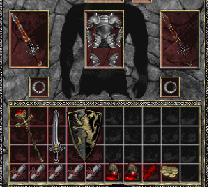
So many icons! (These are not, however, my favourites.)
There was enthusiastic support for this notion. So much for that threat. Still: an Artist never bluffs, so this week we’re going to talk about My Favourite Icons.
Oh yeah, heads up: the first one is cannibalism, so brace yourself for Thematic Imagery.
First, these will be in no particular order. This isn’t about comparing and judging, this is only about what makes me feel good.

(Off to a fun start, aren’t we!) Yes, cannibalism! It’s just … dark and bloody and maddened and I quite like how it captures that feeling.
“Cannibalism Extreme”
 For those who know it, this is of course a reference to the Black Paintings by Goya, in particular what is perhaps the most famous, called “Saturn Devouring His Son”.
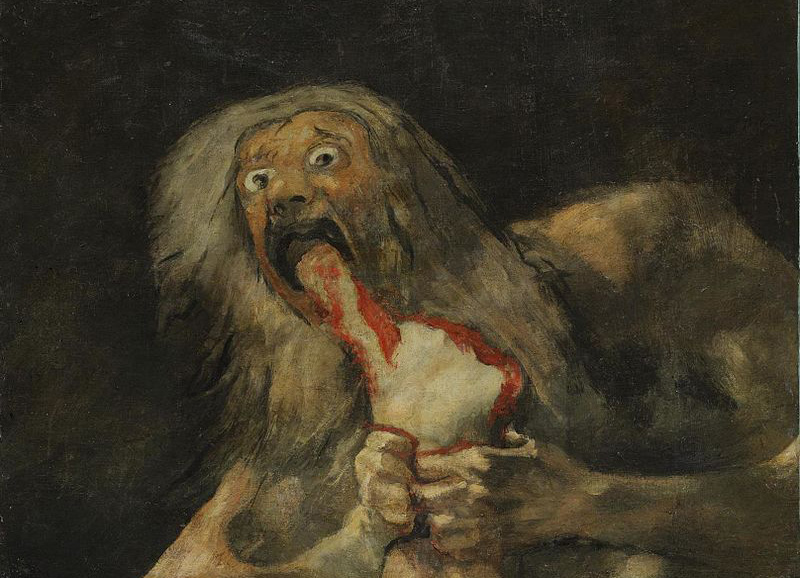
I believe the previous cannibalism icon is a refinement of this one, but I’ve left this in the files because I enjoy not only how the icon itself captures that theme of self-destructive madness (which is essential to the darker bits of Clockwork Empires) but the Black Paintings themselves are an expression of an artist driven to express a sort of maddened despair, which ties in again to those dark parts of Clockwork Empires. This is what maddened despair in the game is all about, at least in terms of a character’s inner mindset.
“Fishperson Happy”

It’s just so happy. And cute. But a little deranged perhaps? And all those sharp teeth …
I like how this captures the essence of Fishpeople in Clockwork Empires. Though the design behind their implementation is a bit contentious for various reasons, from contrary aesthetic goals that try very hard to tread around Lovecraft’s original racist imagery to purely mechanical issues with how Fishpeople had to be implemented as “the goblins of CE” to provide a combat challenge in early Early Access … uh, in spite of all of that, I still enjoy hearing player’s reactions to the fishpeople. Because whatever else, it’s never entirely clear what they are supposed to do with them. Are they friendly? Evil? Do you feel bad when they are attacked? One way or another, I think they’re evocative.
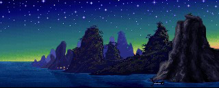
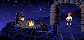
“Late Night”

It’s peaceful, colourful; reminds me a bit of the amazing nighttime scenes from Monkey Island and Loom that I love so much and were so influential to me when I first experienced them growing up.
 The shape is also meant to suggest the medieval “book of hours”, or the uh – hang on, copy-paste time: Très Riches Heures. From wikipedia, here’s a sample:
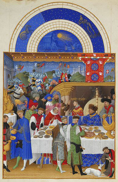
So you know, passage of time, suggestion of the round ‘celestial sphere’ and so on. These icons are used to show the shifts of the day, and just so this book portrays the passage of time and what is done with it.
It sure beats having a boring clock.
“Exploration”

There’s some kind of hyper-real tactility to lushly rendered tools and objects which I greatly enjoy. Reminds me of the richness of art in inventory in, for example, Diablo 1. Everything contributed to how rich it felt to interact with objects from the art to the sound to the smooth drag & drop. It’s a wonderful experience.
Similarly for the Lucasarts games, though they were a bit less lush in the whole experience, the stylized richness of inventory was a real treat.
(You can see why, perhaps, I had so much fun drawing items for Dredmor back in the day.)
“Vegetable Stew”

The previous commentary applies very much to the commodity icons in Clockwork Empires. I’m showing this one because it’s based on a delicious vegetable stew I had a couple days before — here’s the recipe if you’re interested, it’s really easy to make!
“Fungus Category”

I did icons for a number of ‘general categories of items’. Here for instance we have fungus. Now it’s quite a challenge to jam a variety of fungi into one composition inside a 64×64 icon, and it reminds me somewhat of trying to draw a food-based still life painting – because it’s not enough to just jam the objects together, they have to work together.
Here’s a vegetably example from one Pieter Aertsen:
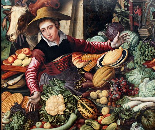
What can I say? That looks like a tasty pile of food.
I’ll wrap it up here. I can ramble about the icons in this game all day and at great length, but that gives an idea of what my thoughts were when making a few of them that I enjoyed.
In the meantime, back to work and getting the game ready to launch. We’re all nervous – and excited!
My favorite thing about Clockwork Empires is actually the stockpiles of commodities. The cabbage baskets, the giant oversized mystery meat steaks, it’s all rather nice to watch the colonists trudge about with them and put them neatly away.
Nothing says “Mystery Meat Monday” (because we ran out of non-meat) like a big, oversized meat steak! 😀
I agree that fishperson are a really great idea narratively and aesthetically (even though i prefer the face in the icon than their face in game :p).
They also help being the “unique” creature of the game, like the diggles of dredmor.
They’re right into the uncanny pond. And as you say there’s no “right” answer when you try to deal with them.
One thing is certain, eating them can be … unfortunate.
I miss the days shortly after I started playing when you could make friends with fishpeople. That was a glorious couple of weeks.
I have loved all the icons since day 1, and have always enjoyed seeing new ones. It’s nice to see some of the inspiration for them as well now.